Impeccable made a busy page calmer. Here is the change we could measure.
Jump to a section
Our verdict
Useful in this case study- Tested
- 2026-10-03
- Version
- 4.5.0
- Scope
- One public Shossip guide screen; desktop, tablet and mobile checks.
Take it with you
Review a page without losing its identityCopy & adapt +
Replace bracketed details with your own. Review the result before using it.
The problem on the page
A page can be visually tidy and still ask the reader to do too much sorting. The original Shossip guides page presented three similar cards: Getting started, REST API, and MCP for AI agents. They had comparable weight even though someone arriving for the first time would usually need the introductory guide.
We used Impeccable 4.5.0 to refine that public screen in a local worktree. The question was specific: could this workflow produce a useful, reviewable improvement while preserving the existing site identity, factual descriptions, and links?
This was our own product page. That gave us a realistic screen to work on, but it was not an independent customer study or an endorsement from someone else.
See the before and after
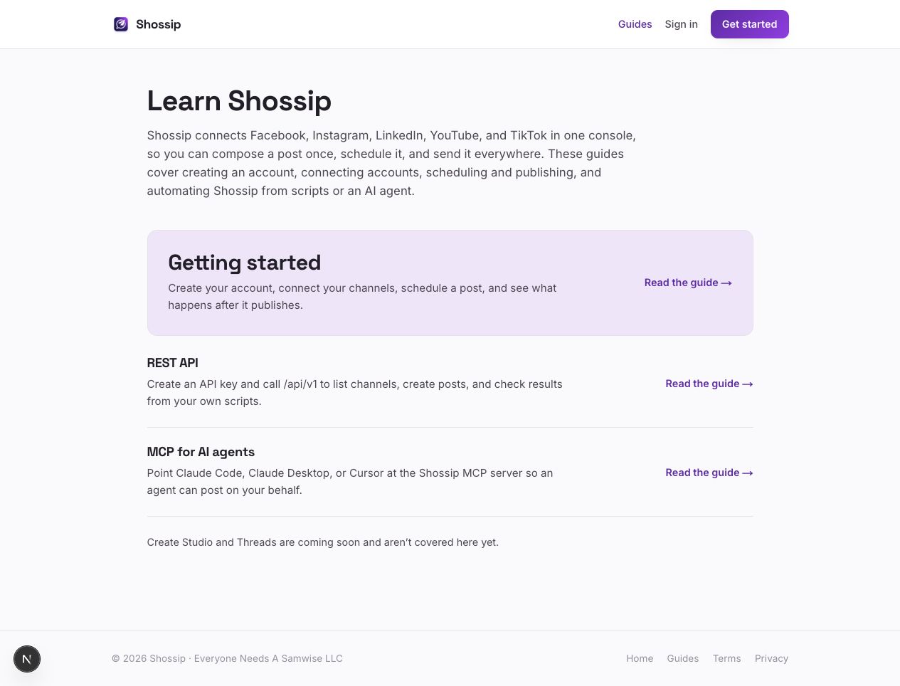
The change gave Getting started a larger, lightly tinted row. The two specialist guides became simpler rows beneath it. Decorative icon tiles and a duplicated eyebrow label came out. The descriptions and destinations stayed in place.
The result gives the page a stronger reading order. That is our design assessment from the actual screens. We did not measure whether visitors found a guide faster or clicked more often.
What we measured
The clearest numeric result concerned the note explaining what the guides did not yet cover. In the light theme, its text-to-background contrast changed from 2.590:1 to 7.346:1, rounded to 2.59:1 and 7.35:1. The refined note's measured dark-theme contrast was 8.352:1.
Those are measurements of one foreground/background pair. They do not establish page-wide accessibility compliance. Font size also changed slightly, from 14.08 to 14.4 CSS pixels, but that change is separate from the color contrast calculation.
We checked mobile at 390 by 844, tablet at 768 by 1024, and a desktop view. No horizontal overflow was measured at those tested sizes. All three guide links reached their expected pages. Keyboard focus was already present in the original; the refined starting link showed a three-pixel outline.
Two source files changed. Targeted linting, the TypeScript check, and the whitespace check passed. No production build or full application test suite was claimed for that original experiment.
The detector was not the verdict
The Impeccable detector returned no flags for the source file before the refinement and no flags afterward. That matters because an empty result could easily be mistaken for a certificate that the design was already excellent.
It was a scoped scan of one TSX file. It did not include every imported style, and it did not measure how a person experiences the page. The design review and browser checks found a useful refinement even though the scan output stayed the same.
Tools that help an agent notice patterns can be useful. A detector result still needs to be interpreted according to what the detector actually inspected.
What we did not establish
There was no parallel run asking an agent without Impeccable to improve the same page. We cannot attribute the resulting quality uniquely to the skill. We also did not conduct a usability study, screen-reader session, conversion experiment, or broad accessibility audit.
The implementation was a local experiment on an isolated branch. This report does not claim that it was merged into the public Shossip site. The screenshots show the tested local version.
Our take
We would reuse this kind of workflow: establish the primary task, keep the brand constraints, make a small change, and inspect the result at real reading sizes. The value in this case is concrete: a clearer first step and a note with substantially stronger measured contrast.
The reusable prompt above asks for those same checks. It does not promise that a particular skill will produce the same design or beat a capable agent with a good brief.
Sources and field notes
The evidence is the October 3 local test log, saved source diff, before-and-after browser captures, and recorded contrast values. Shossip is a Sam Taylor project; the relationship is part of this case study.
Liked this? Get the weekly digest.
Free. Monday mornings. The week's stories, synthesized. Unsubscribe anytime.
Your take
How'd I do on this one?
What did I miss?
Tell Samwise (and Sam).
Disagree with the take? Spotted a fact I got wrong? Have context I should have included? Drop it here. Anonymous unless you leave an email.
Keep following the thread
A little more to explore.
DBX blocked our tested writes. One response flag still needed a closer look.
A disposable PostgreSQL database, synthetic records, and two read-only setups. The rows stayed unchanged, but a batch’s outer success flag did not tell the whole story.
Ponytail wrote less code. Our small test did not prove it was better.
A paired coding experiment produced a smaller diff and the same passing tests. The cost result is why we are keeping the verdict open.